RTL's Brand Evolution: Much More Than a Logo
As we approach our 30th birthday, we're taking a moment to reflect on a significant milestone in our company's history: our brand refresh eight years ago. This transformation represented far more than a simple logo update; it embodied our evolving identity as New Zealand's trusted supplier for Road Safety, Road Sign and Traffic Management solutions.
Our brand refresh journey began with a recognition that our visual identity needed to align more closely with our core values of safety and exceptional service. We partnered with Brave, a specialist agency who understood the delicate balance between honouring tradition and embracing innovation. Together, we developed a refreshed identity that would carry us forward into a new era of growth while preserving the cultural attachments and traditional values that defined RTL.
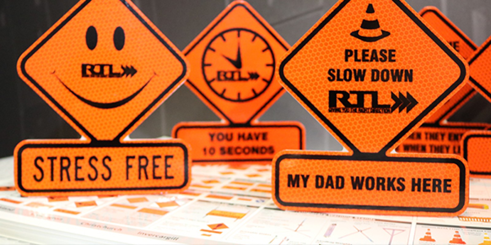
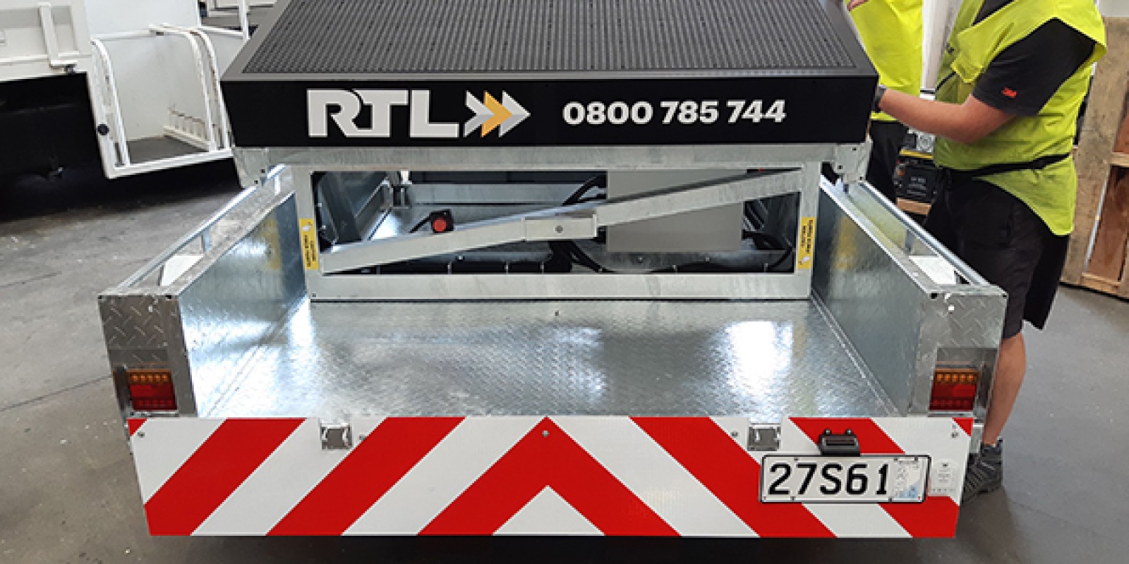
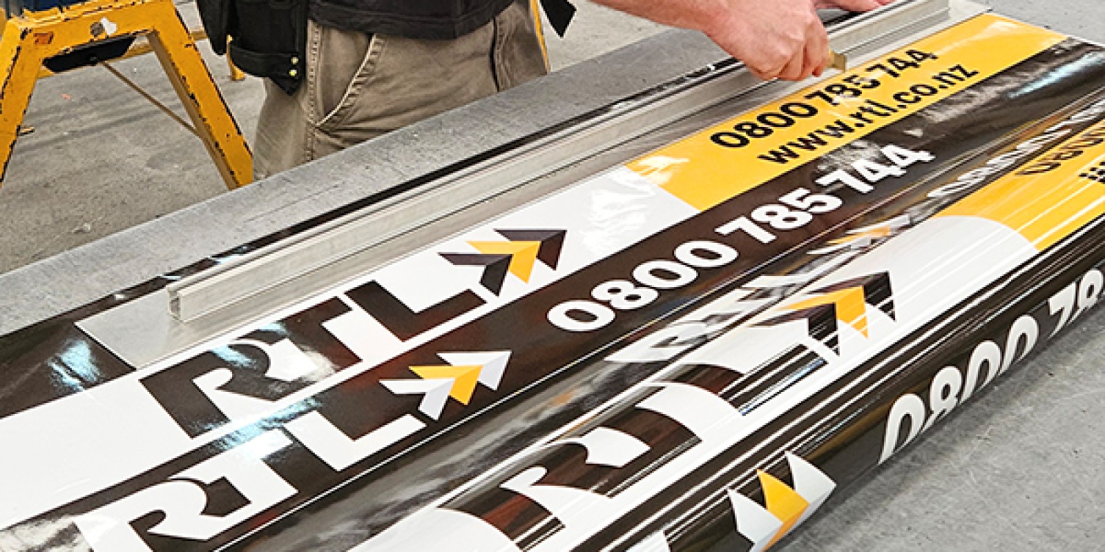
Brave's expertise was instrumental in maintaining our unique identity. They recognised the strong cultural and historical foundations of our brand and skillfully modernised our visual elements without disconnecting from our roots. This thoughtful approach ensured that long-time customers still recognised the RTL they trusted, while new audiences encountered a contemporary brand ready to meet modern safety challenges. The updated logo maintained our recognisable RTL initials while introducing a more contemporary, professional aesthetic. This visual evolution reflected our company's progression from a traditional signage manufacturer to a comprehensive provider of integrated road safety solutions.
Living the Brand: Beyond Visual Elements
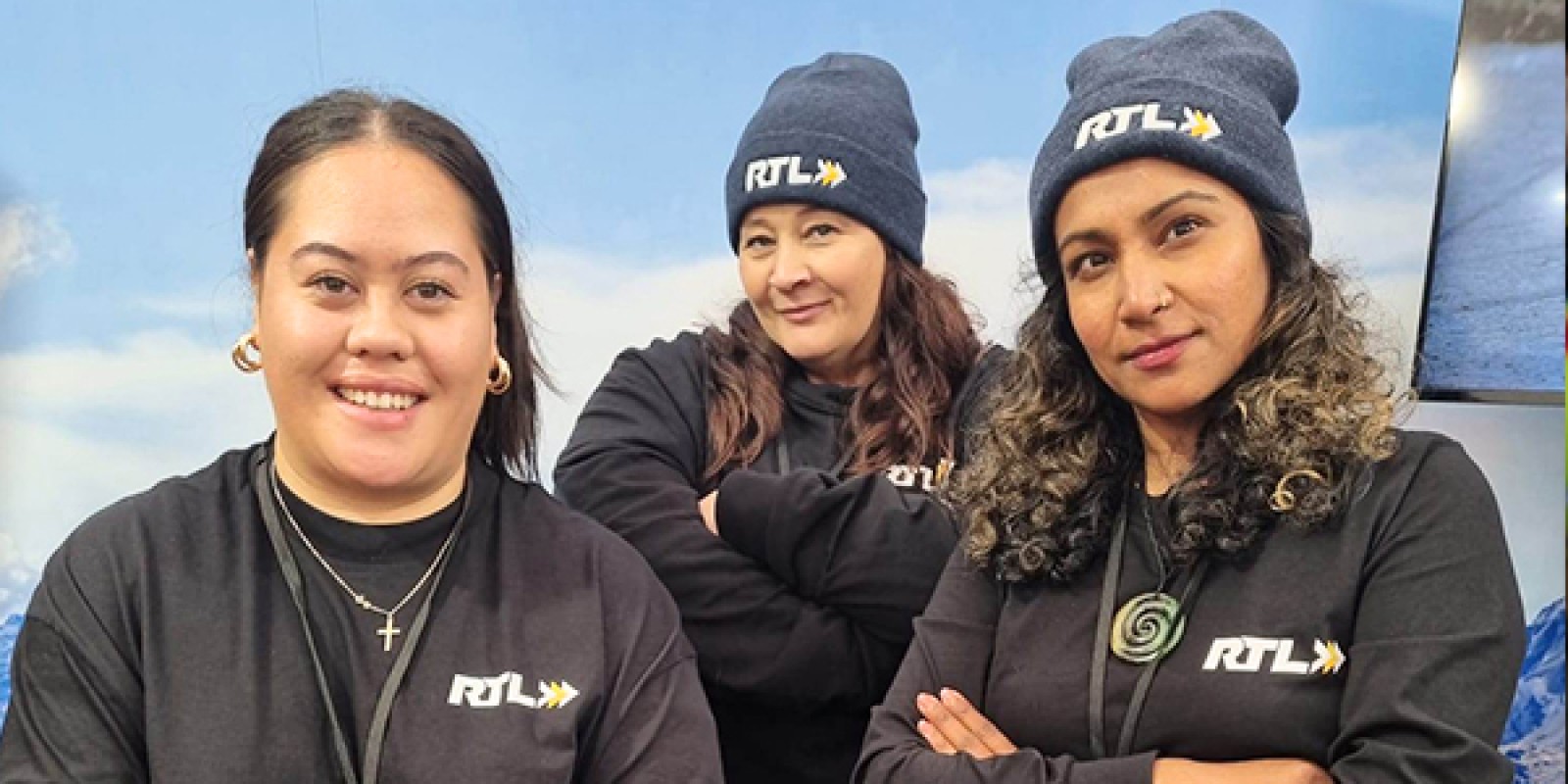
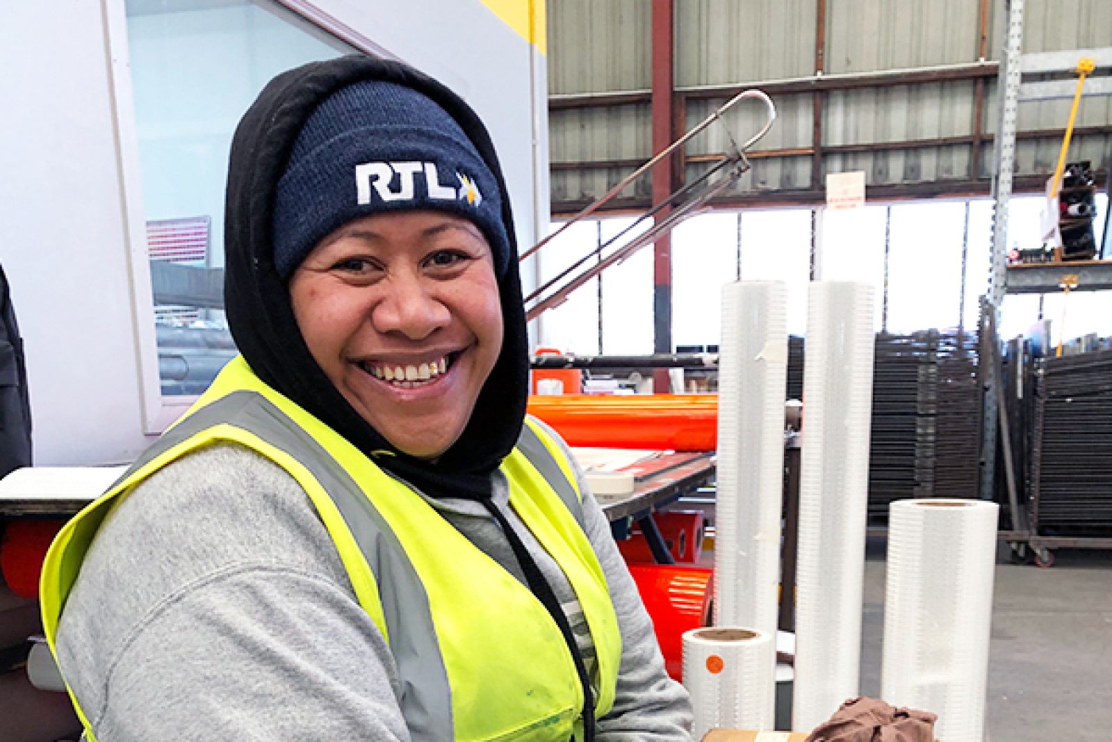
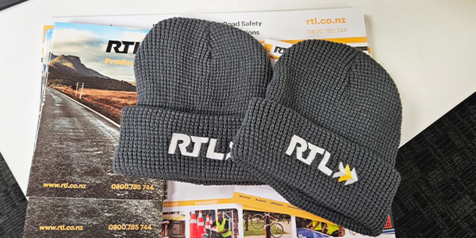
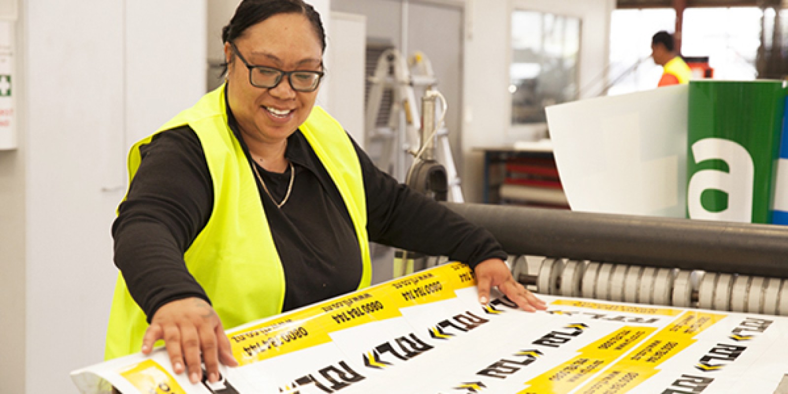
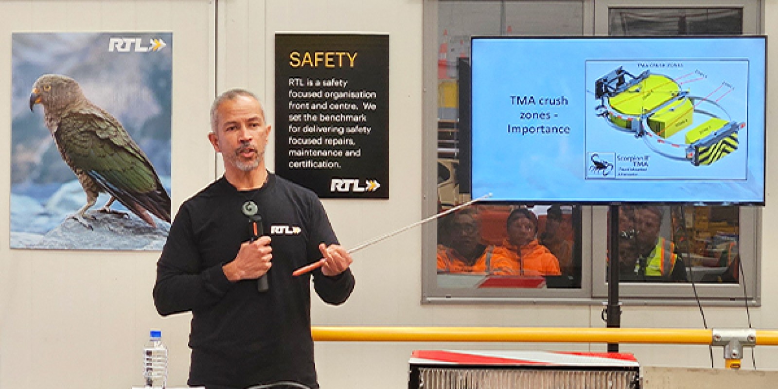
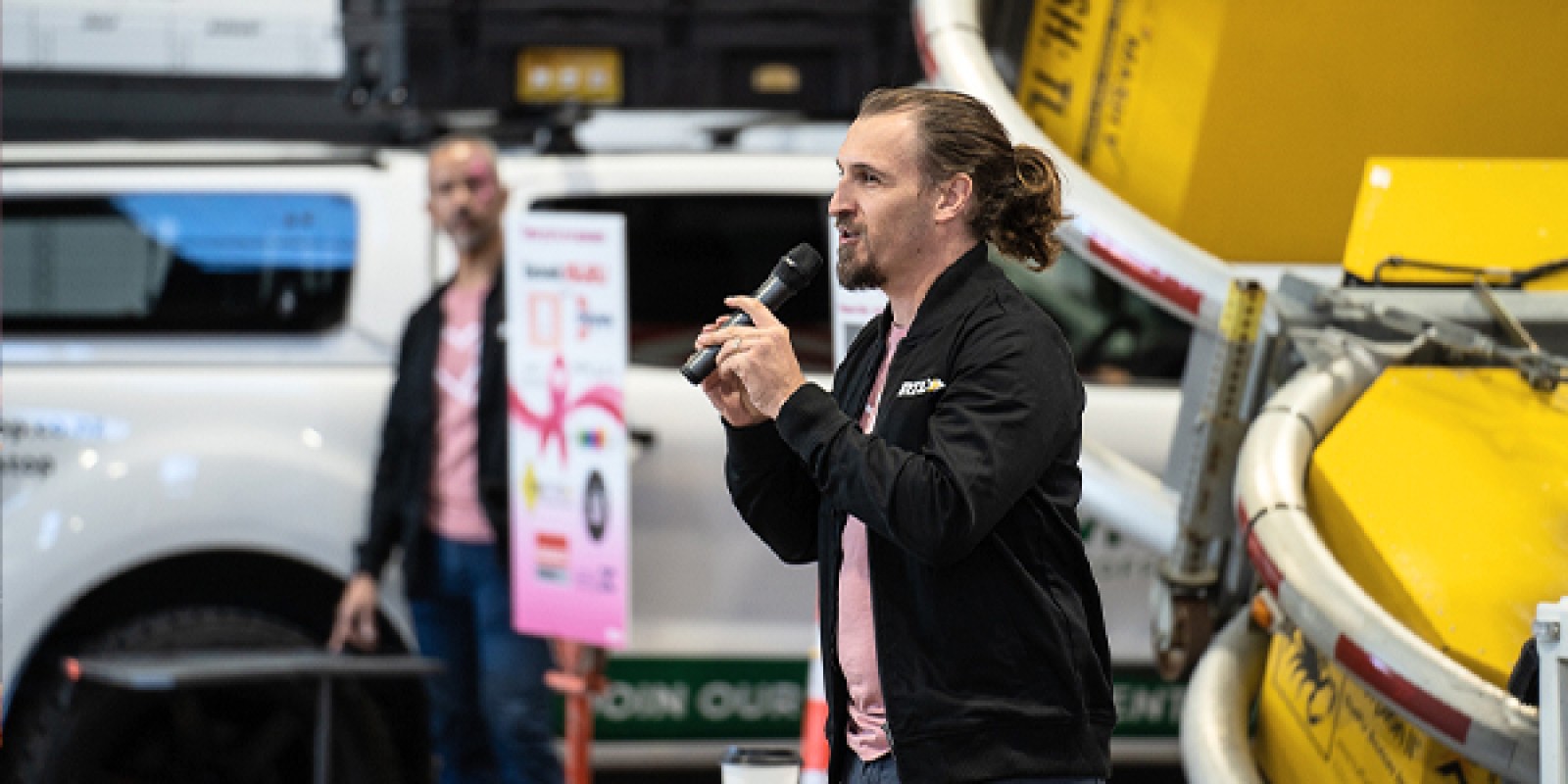
Our refreshed brand truly came to life through its implementation across all touchpoints. We are proof that a brand exists not just in logos and colors, but in every interaction with our company. This understanding guided our approach to integrating our brand identity throughout all aspects of our operations. Our RTL whanau embraced the refreshed branding on uniforms, proudly wearing the RTL logo as a symbol of their own personal expertise and commitment to safety. This sense of pride transformed our staff into genuine brand ambassadors who represent RTL's values in every customer interaction.
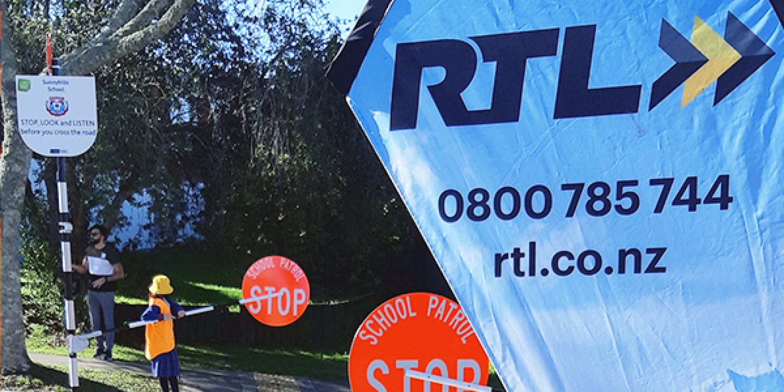
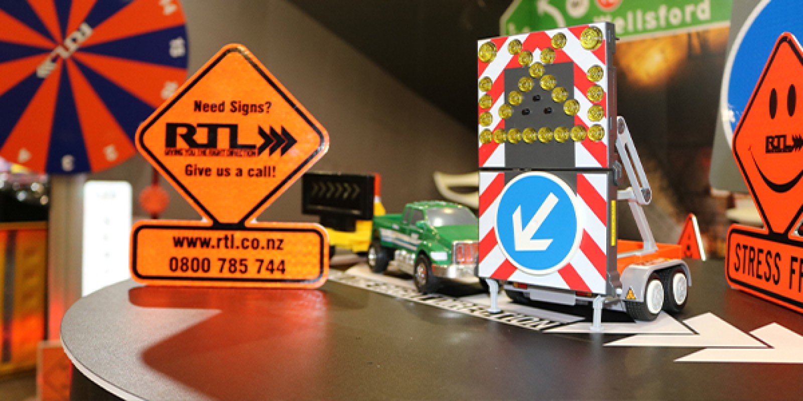
Our equipment, particularly our Light Arrow Signs (LAS), began featuring more prominent branding - turning our deployed safety solutions into visible representations of RTL's presence throughout New Zealand's roadways. Even our company diaries evolved from plain, functional items to distinctive tools that authentically represented our brand personality.
The brand refresh coincided with another significant development in RTL's evolution: the launch of our comprehensive e-commerce platform. This digital presence wasn't simply an online catalogue; it was an extension of our commitment to exceptional service and accessibility. We created a digital experience that made finding and purchasing the right safety solutions more straightforward than ever. The e-commerce platform reflected our brand values through its intuitive design, helpful resources, and customer-focused functionality. This integration of digital capability with our refreshed brand identity positioned RTL as both a traditional expert and a modern, accessible partner.
The Kea Takes Flight
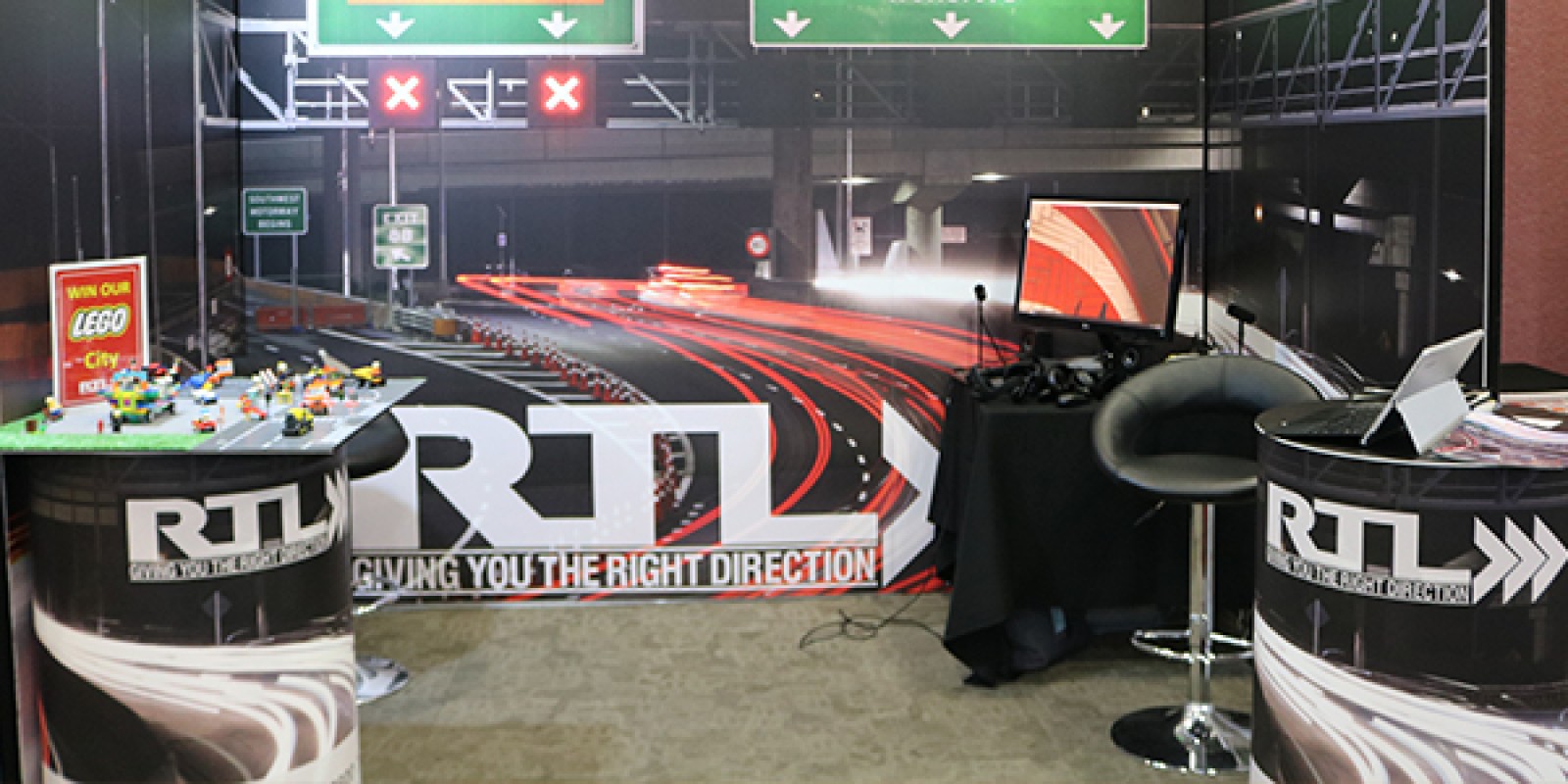
Our brand journey didn't stop with the initial refresh. Three years ago, we took another significant step in our brand evolution by introducing the kea bird as an extension of our identity. This addition came as we increased our presence at conferences and industry events, recognising the need for impactful conference stands and an inspiring brand persona.
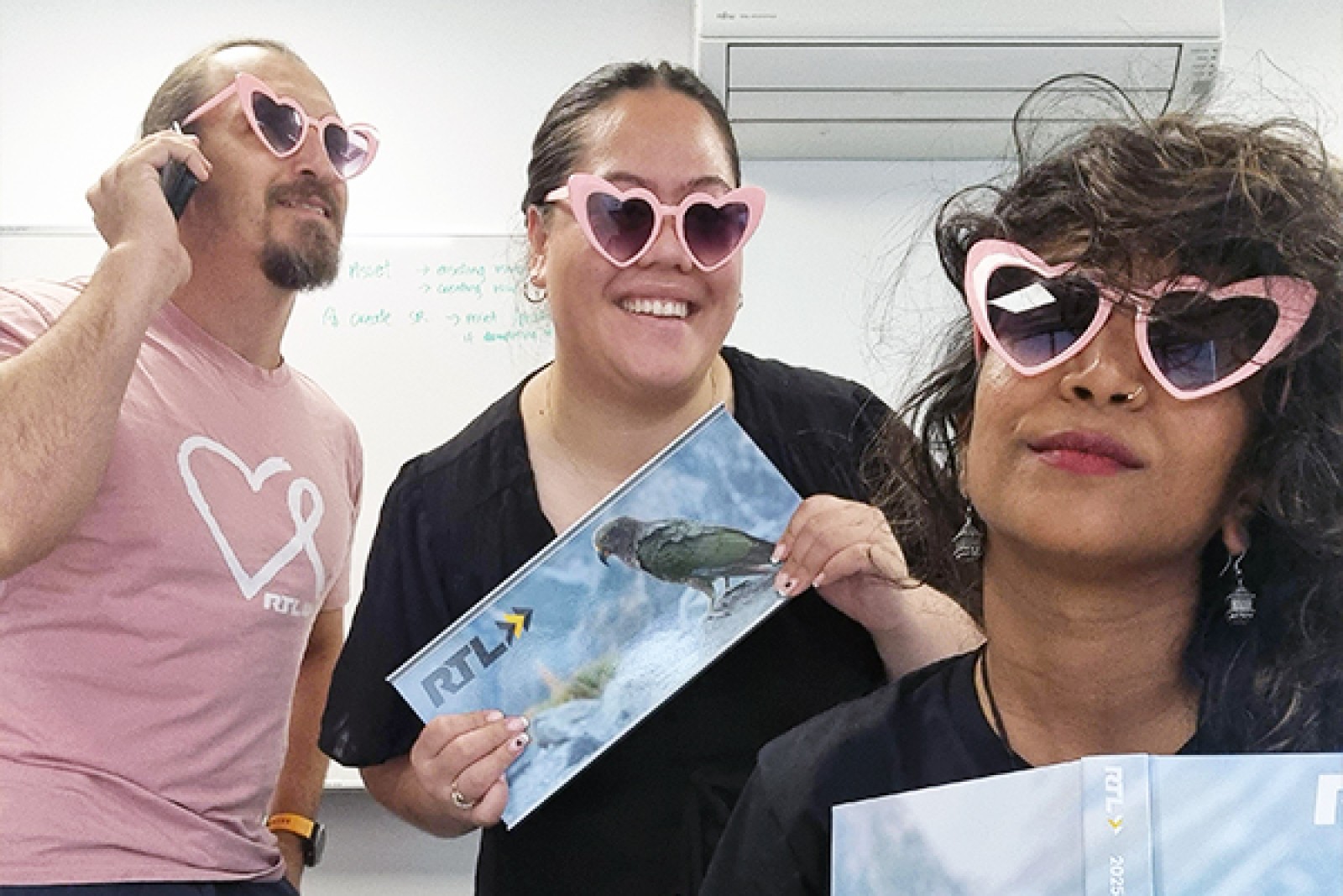
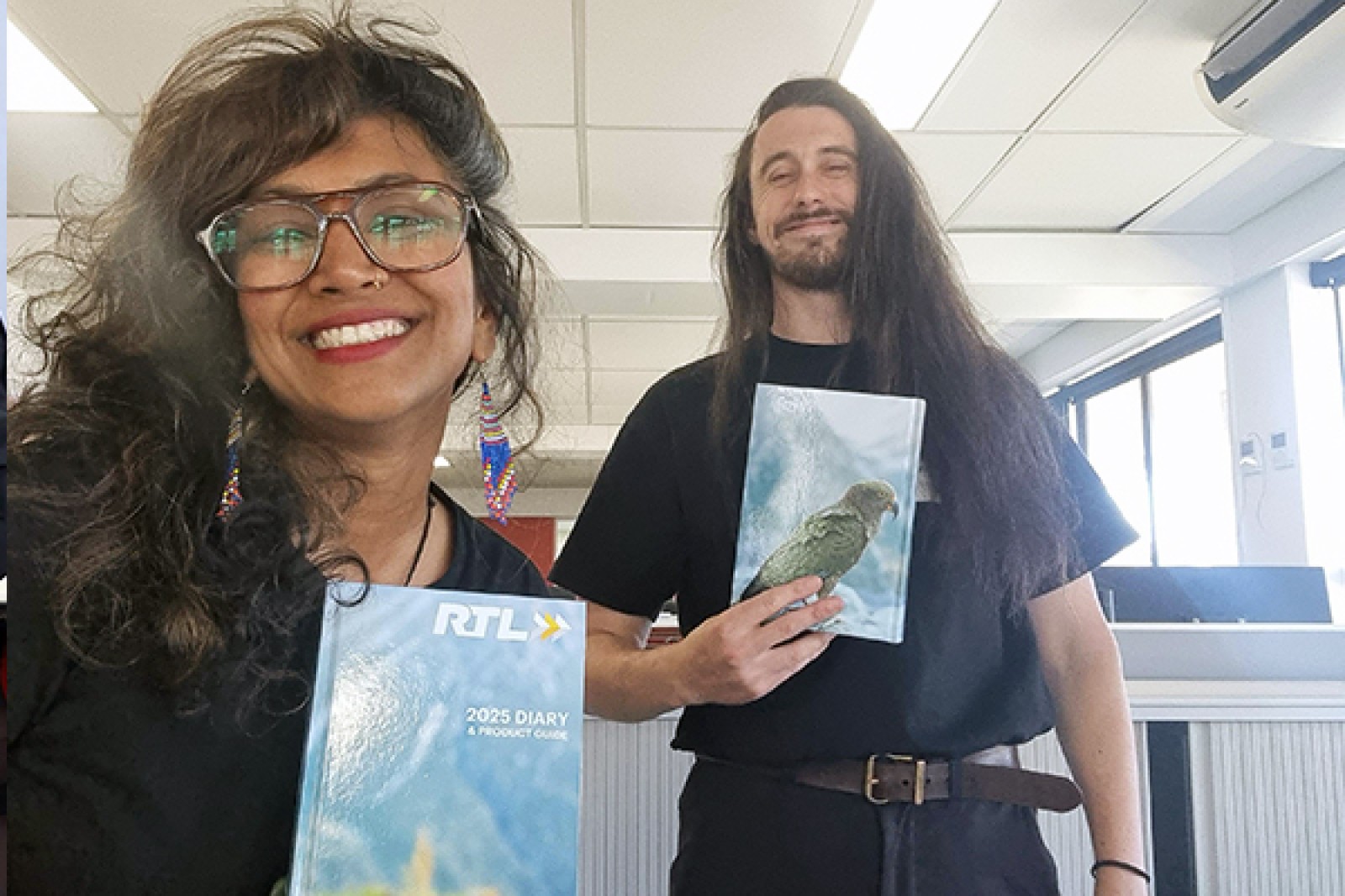
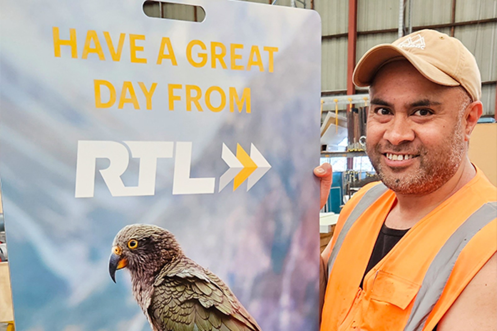
The native New Zealand kea wasn't a random selection - it embodies qualities that align perfectly with RTL's core principles. Known for their intelligence, adaptability, and problem-solving abilities, keas represent the innovative spirit that drives our approach to road safety challenges. As we noted in our brand story, "Like the kea, RTL is uniquely New Zealand. We're resourceful, adaptable and innovative." These parallels created a meaningful connection that resonated with both our team and our customers. The kea became more than a mascot; it became a symbol of our commitment to ingenious, practical solutions for complex safety challenges, and the perfect representation for our increased industry presence.
What It Takes to Refresh a Brand
A successful brand refresh requires more than graphic design - it demands deep organisational introspection and strategic alignment. Our process began with careful consideration of our core values, market position, and future aspirations. Brave helped us engage with stakeholders at all levels to ensure the refreshed brand would authentically represent RTL's essence. Our long-standing supplier relationships demonstrated our commitment to building trust through consistent performance. These partnerships allowed us to deliver superior branded materials while maintaining the highest standards of quality and innovation throughout the refresh process.
Navigating the Challenges of Change
Change management during a brand refresh is never a straightforward path. Within our organisation, we encountered natural resistance - some team members didn't see any need to change the logo that had served us well for years, while others felt a deep emotional attachment to our existing visual identity. These responses weren't obstacles to overcome, but valid perspectives to acknowledge and address. Our approach wasn't to force change, but to lead by example through living our new brand elements every day. By integrating the refreshed identity into meaningful interactions and tools that enhanced our team's work, we demonstrated the practical value behind the aesthetic evolution. Our increased activity on social platforms, particularly LinkedIn, played a crucial role in this transition. Seeing the positive engagement and industry recognition that our refreshed brand generated helped convert even the most traditional team members into brand advocates. This organic approach to change management, focused on demonstrating rather than dictating, proved instrumental in what ultimately became a successful transformation embraced across the organisation.
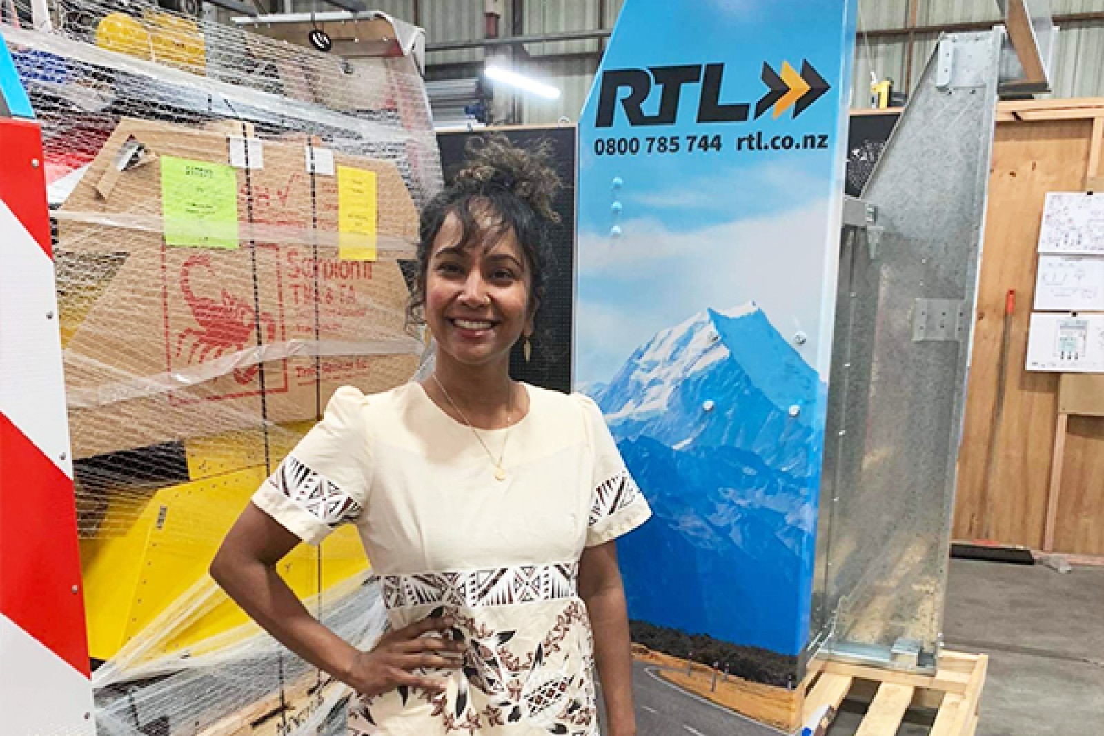
Brand Ambassadors: Our Greatest Asset
Perhaps the most significant element in our brand evolution has been the emergence of passionate brand ambassadors within our team. These individuals don't just wear our logo - they embody our values in every interaction. Their enthusiasm and commitment have transformed our brand from a visual identity into a living culture. Our team members proudly represent RTL at industry events, customer sites, and throughout their communities. This authentic representation comes not from mandates but from genuine alignment with our mission of creating safer environments throughout New Zealand.
Looking Forward: The Next Chapter
As we approach our 30th birthday, we recognise that our brand will continue to evolve just as our industry and customer needs do. The foundation we established eight years ago with our brand refresh, enhanced by the introduction of our kea ambassador, provides a strong platform for this ongoing evolution. Our industry is currently navigating challenging times, but we draw inspiration from our kea symbol. Like these remarkable birds who are endangered but still perservering through adaptability and resilience, our brand and industry will rise to meet these challenges. The same ingenuity, determination, and uniquely New Zealand spirit that defines both the kea and RTL will ensure we don't just survive - we soar.